"A type of packaging for CDs or DVDs, typically made from cardboard with an internal plastic holder for one or more disk."


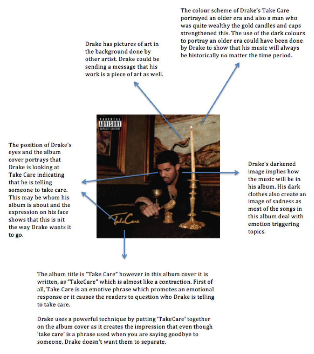
The image below is Drake's digipak for his album "Take Care" the genre of this album is
a mix of R&B, hip hop and pop music.
The CD for the album itself follows the colour scheme of black and gold of the album front cover. It has no picture of anything and only has DRAKE and the album name. This could imply that Drake feels as if he is a well known artist and everyone knows who he is already.
The colours still connote wealth (Gold and black) and it also implies a classic as the colours are so simple.

The back of the album is simple and only includes the track names and credits to his producers. The simplicity of the back cover suits Drake's target audience because it is stereotypical for males to like simple designs as they are mostly interested in the tracks. The capital letters of all the songs makes it more bold and more forthright which links to Drake as an artist. The colours, black and brown, create a serious atmosphere which links to his style of music and he normally mentions the struggles of relationships and life. The design creates an unfinished effect which could represent his songs as an unfinished battle.

I feel that Drake's 'Take Care' album is conventional to the stereotypes of black male R&B and rap artist. In my opinion the design on his digipaks links with his target audience due to various reasons which I have explained in the paragraphs above such as the back cover of the digipak having a simple design to link to the male audience as they stereotypically like simple things compared to females who are stereotypically more complex.
No comments:
Post a Comment